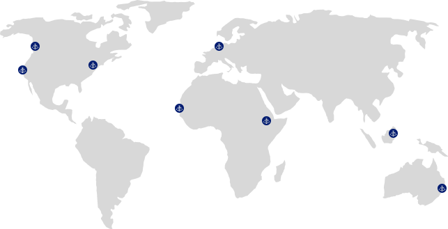
Our global community supporting over 1000+ entrepreneurs a year both physically and online, gives you access to a diverse network of founders, investors, mentors, and like-minded entrepreneurs.
Gain access to resources that support and elevate your startup journey. These include a comprehensive suite of resources, such as pro bono mentoring, discounts worth $200K from Hubspot, AWS, and more.
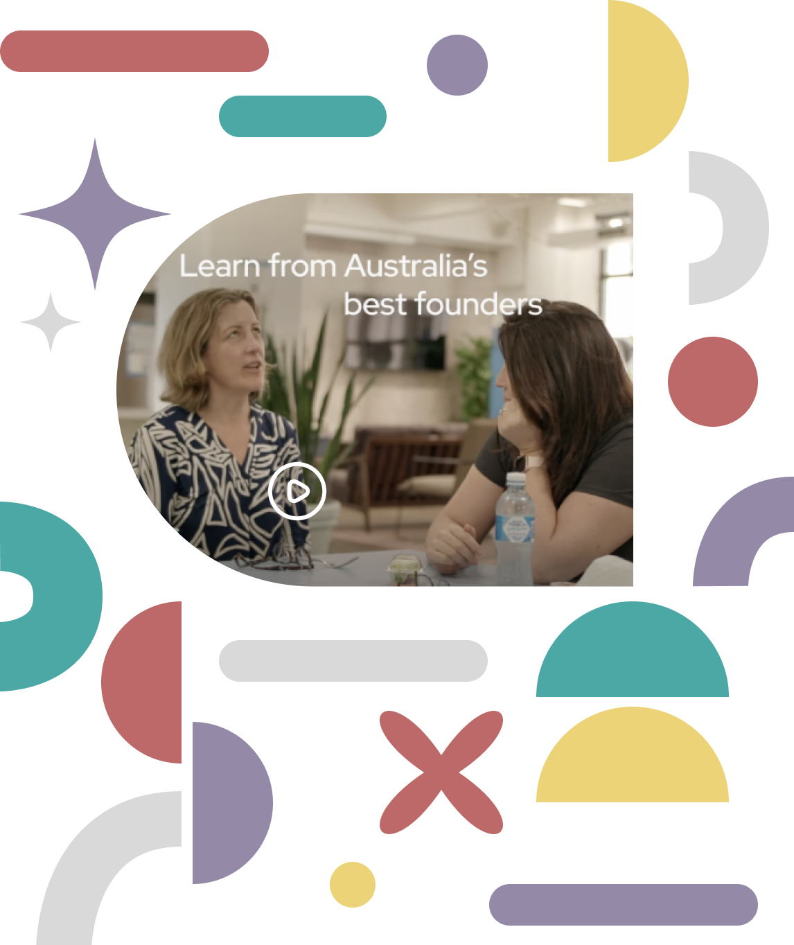
As the driving force behind some of Australia’s most successful startups, including Koala, Jayride, Homecare Heroes, and V2 Foods, Fishburners is committed to advancing the culture of innovation and entrepreneurship.
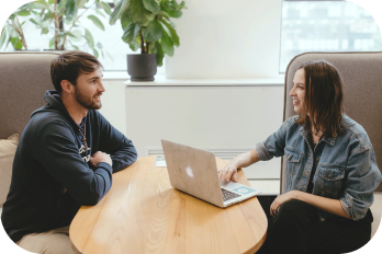
Become a part of Australia’s largest tech community and gain access to a diverse mix of entrepreneurs, founders, and freelancers. Our flexible spaces, online network and numerous perks are designed to accelerate the growth of your startup or scale-up.
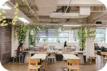
With an amazing location on top of Wynyard station, our light, airy and creative coworking facilities offer a range of affordable options for single founders to teams of up to 20